How to Color the Keys of the On-Screen Keyboard
As of version 1.4.0, it is now possible to color the keys of the on-screen keyboard.
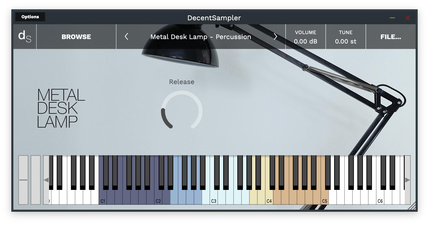
This can be useful for showing different ranges of notes that serve different purposes or highlighting notes used as keyswitches. In order to implement colored keys, make use of the new <keyboard> and <color> elements as follows:
<DecentSampler>
    <ui>
        <!-- Other stuffhere -->
        <keyboard>
            <color loNote="36" hiNote="50" color="FF2C365E" />
            <color loNote="51" hiNote="57" color="FF6D9DC5" />
            <color loNote="58" hiNote="67" color="FFCCF3F5" />
            <color loNote="68" hiNote="73" color="FFE8DA9B" />
            <color loNote="74" hiNote="84" color="FFD19D61" />
        </keyboard>
    </ui>
    <!-- Other stuff here -->
</DecentSampler>
By default, Decent Sampler highlights all of the notes that are mapped for a given sample. If you use the color keys feature, this default highlighting will be turned off and it will be up to you to color whatever keys you want.
Full documentation for the color element is here.
How to turn keyboard note coloring on and off using bindings
It also possible to programmically turn keyboard coloring on and off using bindings. Here’s an example of how to do that:
<DecentSampler>
    <ui>
        <button name="Strum Enabled" x="464" y="82" width="14" height="14" style="image" value="1" visible="false">
        <state name="Off" mainImage="Images/StrumsCheckboxUnchecked.png" hoverImage="Images/StrumsCheckboxUnchecked.png" clickImage="Images/StrumsCheckboxUnchecked.png">
            <binding level="ui" type="keyboard_color" colorIndex="0" parameter="ENABLED" translation="fixed_value" translationValue="false"/>
            <binding level="ui" type="keyboard_color" colorIndex="1" parameter="ENABLED" translation="fixed_value" translationValue="false"/>
            <binding level="ui" type="keyboard_color" colorIndex="2" parameter="ENABLED" translation="fixed_value" translationValue="false"/>
            <binding level="ui" type="keyboard_color" colorIndex="3" parameter="ENABLED" translation="fixed_value" translationValue="false"/>
            <binding level="ui" type="keyboard_color" colorIndex="4" parameter="ENABLED" translation="fixed_value" translationValue="false"/>
        </state>
        <state name="On" mainImage="Images/StrumsCheckboxChecked.png" hoverImage="Images/StrumsCheckboxChecked.png" clickImage="Images/StrumsCheckboxChecked.png">
            <binding level="ui" type="keyboard_color" colorIndex="0" parameter="ENABLED" translation="fixed_value" translationValue="true"/>
            <binding level="ui" type="keyboard_color" colorIndex="1" parameter="ENABLED" translation="fixed_value" translationValue="true"/>
            <binding level="ui" type="keyboard_color" colorIndex="2" parameter="ENABLED" translation="fixed_value" translationValue="true"/>
            <binding level="ui" type="keyboard_color" colorIndex="3" parameter="ENABLED" translation="fixed_value" translationValue="true"/>
            <binding level="ui" type="keyboard_color" colorIndex="4" parameter="ENABLED" translation="fixed_value" translationValue="true"/>
        </state>
      </button>
        <keyboard>
            <color loNote="36" hiNote="50" color="FF2C365E" />
            <color loNote="51" hiNote="57" color="FF6D9DC5" />
            <color loNote="58" hiNote="67" color="FFCCF3F5" />
            <color loNote="68" hiNote="73" color="FFE8DA9B" />
            <color loNote="74" hiNote="84" color="FFD19D61" />
        </keyboard>
    </ui>
    <!-- Other stuff here -->
</DecentSampler>